Multivariate Analysis of the Dow Jones Industrial Average

OBJECTIVE

The objective of this project was to develop a model that, for a specific observation of current indicators of the Dow Jones Industrial Average (DJIA) index:

  • Predicts the next period’s return for DJIA via Linear Regression
  • Recommends whether to Buy / Sell DJIA index via Logistic Regression

Principal Component Analysis was used for dimension reduction

Motivation: Utilize these models to inform investment decisions regarding the DJIA.

BACKGROUND AND DATA

Inputs and Outputs

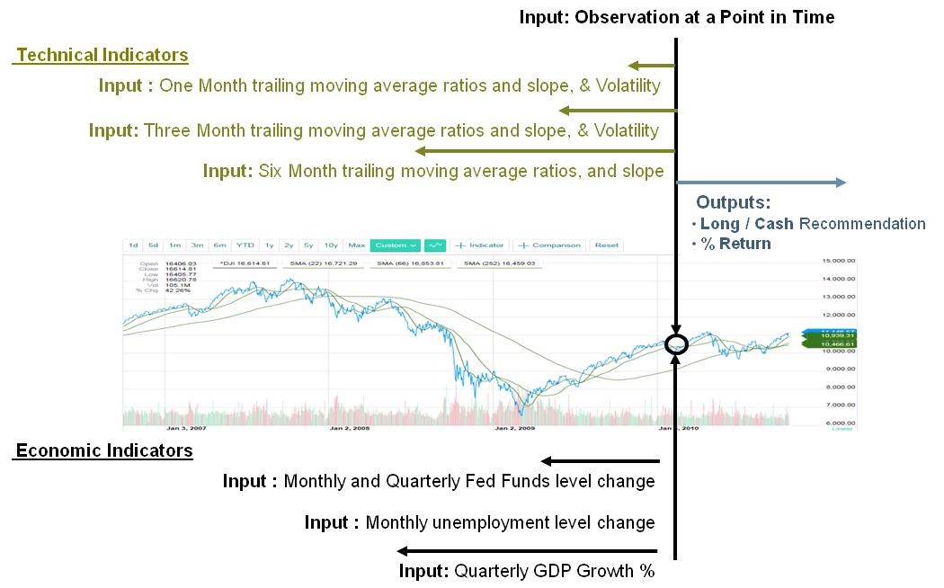
Both technical and macro-economic indicators were used as inputs to the model

DJIA

Inputs – Technical indicators

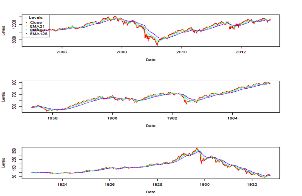
  • Exponential moving averages over different rolling periods.  This helps smooth the signal as well as capture the temporal nature of the point in time observation.
  • Slopes of exponential moving averages.  This helps also helps capture the temporal nature of the point in time observation.
  • Ratios of these moving averages (i.e. is the 21 day EMA higher than the 126 day EMA).  These are significance of these ratios is explained in the next section.
  • Annualized Volatilities: Accounts for the dispersion of the rate of change – in times of stress volatility tends to increase.

Inputs – Macro indicators

  • Fed Funds rate changes:  Negative changes tend to indicate easing or a view that the Fed feels the economy is slowing down or in recession.
  • Unemployment level changes
  • QDP growth.

Outputs

  • Expected forward returns calculated.
  • Long (Buy) / Cash (Sell) indicator

Technical Indicators – Background

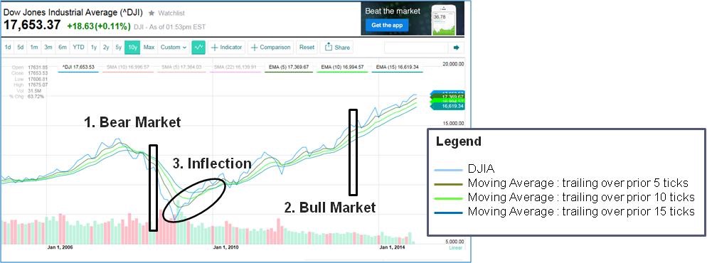
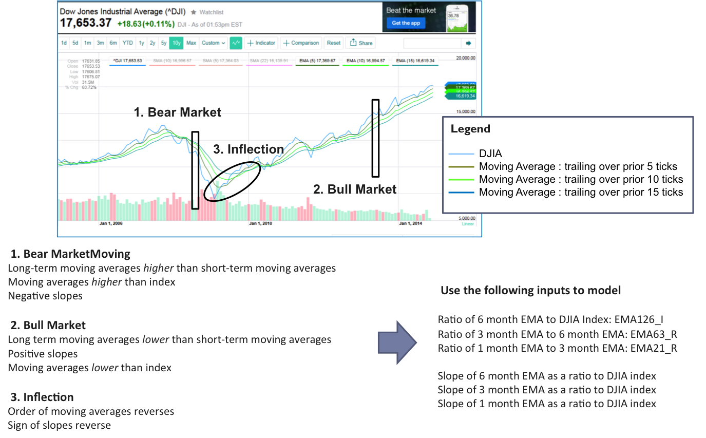
Below are the conditions found in different types of markets

Indicators

Bear Market

  • Long-term moving averages higher than short-term moving averages
  • Moving averages higher than index
  • Negative slopes

Bull Market

  • Long term moving averages lower than short-term moving averages
  • Positive slopes
  • Moving averages lower than index

Inflection

  • Order of moving averages reverses
  • Sign of slopes reverse

Based on this the following technical indicators were used

  • Ratio of 6 month EMA to DJIA Index: EMA126_I
  • Ratio of 3 month EMA to 6 month EMA: EMA63_R
  • Ratio of 1 month EMA to 3 month EMA: EMA21_R
  • Slope of 6 month EMA as a ratio to DJIA index
  • Slope of 3 month EMA as a ratio to DJIA index

Sourcing and Training and Validation Data

Data was sourced from:

  • DJIA levels: finance.yahoo.com
  • Slopes and Ratios: Calculated
  • Volatilities: Calculated
  • Macro Economic Data: government sites including Fed

Daily observations were collected, technical indicators calculated, and macro economic data overlayed.  Then weekly observations were extracted:

  • 3037 weekly observations from 1954 through 2013
  • 2986 post removal of outliers
  • Training Data – Selected a random 75% of observations
  • Validation Data – Utilized remaining 25% of observations

Data Preparation

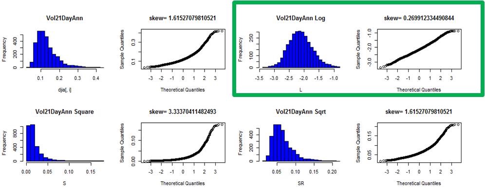
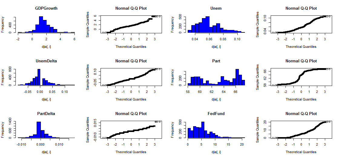
  • The distributions of each input and continuous output variable were analyzed
  • Different transformations were attempted, where required, to achieve normality
  • The data was then standardized and centered data by shifting assigning Z score.
  • Below the 21 day volatility transformation example is illustrated …

Histograms

Data Fields

Inputs (15 variables) and Target (3)

Inputs

Data Summary Post Centering and Normalizing

The table below shows the correlation matrix of the normalized, centered, continuous variables

CorrMatrix

  • As expected there is a high |absolute| correlation among the different moving averages, slopes and ratios
  • Similarly there is a correlation between the 21 and 63 day volatilities
  • Lastly the 1 month and 1 quarter change in Fed Funds rate also shows a level of correlation.

One of the key decisions was which time frames to include or exclude – instead of making that decision a-priori I used PCA to reduce dimensionality and remove multi co linearity.

PRINCIPAL COMPONENT ANALYSIS

PCA was applied to the input variables for the reasons listed in the prior section.

The first 4 PC’s were selected because

  • Their Eigenvalues > or close to 1
  • Their Cumulative variance accounted for 83% of the total.

PCAs

This reduced the problem from a 15 variable model to four.

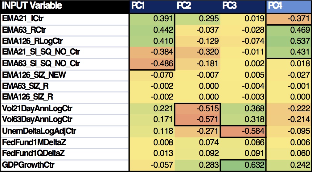
Then the rotation eigenvectors were used to interpret the meaning of the PC’s:

Eigens

Based on the above, the following interpretations can be made:

PCAInterpret

LINEAR REGRESSION

Linear regression was applied to try to try to predict the forward monthly return of an observation:

  • FwdReturn: a linear function of (PC1,PC2,PC3,PC4)
  • In R the formula pattern is: train$FwdMReturnCtr ~ train$PC1 + train $PC2+ train$PC3+ train$PC4

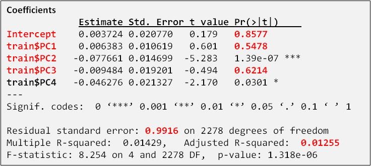
The coefficients and best fit description was as follows:

Linear

Observations & Conclusions

  • Pr(>t) values lead us to Accept the Null Hypothesis that Intercept and Coefficiens in Red = 0.  In other words this intercept and coefficients cannot be used.
  • Adjusted R Squared is exceedingly low at 0.0125

Similar results were seen when the actual centered and normalized 15 Varibles were used.

This leads to the following conclusions –

  • The behavior of forward returns as a function of the inputs cannot be modeled Linearly over this extensive time period (1954 to 2013). 
  • It is possible a better fit may be obtained for specific, shorter time periods, e.g. for specific types of Cyclical markets.  I actually observed this in a prior class where a Decision Tree or Neural Network derived from the training data was more accurate for short Cyclical periods as compared to application to the entire timeline.  This was not attempted here, though I still suspect the relationship is not likely to be linear.

LOGISTICS REGRESSION

A logistic regression was applied as follows –

  • log(odds(LongPosition))= a linear function of (PC1,PC2,PC3,PC4)
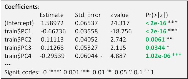
  • In R: mylogit2 <- glm2(train$CycLC ~ train$PC1 + train $PC2+ train$PC3+ train$PC4, family=”binomial”)

logit

Observations on Logistic Model

  • Pr(>t) values lead us to Reject the Null Hypothesis that Intercept and Coefficiens in Green = 0.  In other words we have a 96% + confidence level in these intercept and coefficients.
  • So why did linear regression fail whereas logistics regression (at least at this point) appeared to do better?  My interpretation is that when the ‘crowd’ makes decisions to enter or exit the market, they are ‘taking a bet’, based on a conscious or unconscious view on the Odds of that Bet.  That odds decision appears to fit a linear model (i.e. a Linear Logistics Regression).

Validation of Model

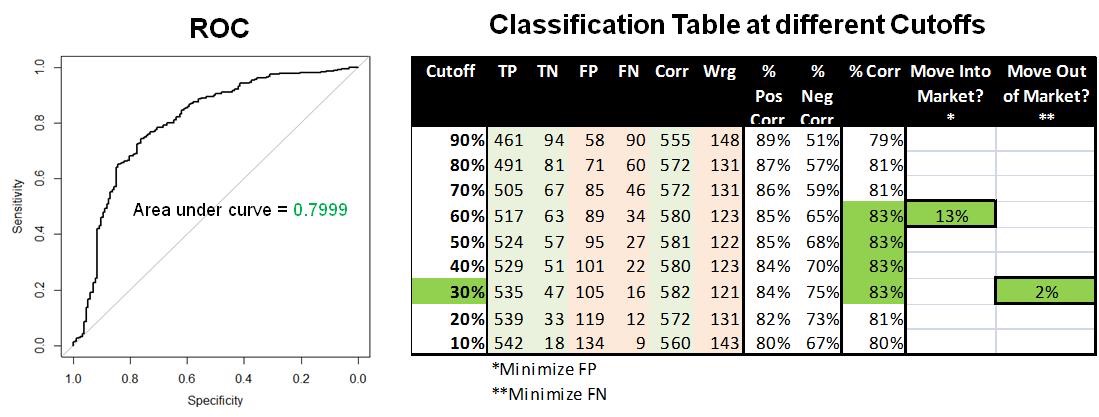
The model was applied to the Validation data to assess accuracy of results …

roc

The area under the ROC curve is  of 0.7999 which would indicate reasonably good predictions.

The maximum % Correct predictions are at a cutoff between 30% to 60% probability.

For a Move into Market signal (i.e. move from Cash to Long), you want to minimize false positives which yields a cutoff at 30%.   

  • At this level, we see 89 out of 703 observations are False Positives = 13%. 
  • Another measure is proportion of False Positives / Actual Positives) = 89/(517+34) = 16%. 
  • This compares to a total actual positives of 79%. 
  • Hence the logit model is definite improvement over a ‘random draw’ from the sample distribution.

For a Move out of Market signal you want to minimize false negatives, with yields a cutoff at 60%

  • At this level, we see 16 out of 703 observations are False Negatives = 2%
  • Another measure is proportion of False Negatives / Actual Negatives =16/(63+89) = 11%. 
  • This compares to a total actual negatives of 21%. 
  • Hence the logit model is a good improvement over a ‘random draw’

CONCLUSIONS

  • PCA yielded significant dimension reduction and intuitive principal components
  • Linear regression unable to yield a good model – interactions among variables not linear at least for the length of period explored.
  • Logistic regression resulted in a reasonable level of accuracy

NEXT STEPS

While the Logistics Model shows promise, the ultimate test is to back test it, simulating Buys and Sells over a historical period of time, and comparing the resulting returns to the actual DJIA return (i.e. Hold) as well as to actively managed leading broad index mutual funds under different market conditions.

============

APPENDIX

Sample R snipets

Outliers Removal

myOutlierIndexEMA21_Sl <- which(djia$EMA21_SlZ_NEW<(-3) | djia$EMA21_SlZ_NEW>(3))

myOutlierIndexEMA63_Sl <- which(djia$EMA63_SlZ_NEW<(-3) | djia$EMA63_SlZ_NEW>(3))

myOutlierIndex<-union(myOutlierIndexEMA21_Sl, myOutlierIndexEMA63_Sl)

myOutlierIndexEMA126_Sl <- which(djia$EMA126_SlZ_NEW<(-3) | djia$EMA126_SlZ_NEW>(3))

myOutlierIndex<-union(myOutlierIndex, myOutlierIndexEMA126_Sl)

myOutlierIndexEMA126_Sl_R <- which(djia$EMA126_SlZ_R<(-3) | djia$EMA126_SlZ_R>(3))

myOutlierIndex<-union(myOutlierIndex, myOutlierIndexEMA126_Sl_R)

myOutlierIndexEMA63_Sl_R <- which(djia$EMA63_SlZ_R<(-3) | djia$EMA63_SlZ_R>(3))

myOutlierIndex<-union(myOutlierIndex, myOutlierIndexEMA63_Sl_R)

myOutlierIndexFFM<- which(djia$FedFund1MDeltaZ<(-4) | djia$FedFund1MDeltaZ>(4))

myOutlierIndex<-union(myOutlierIndex, myOutlierIndexFFM)

myOutlierIndexFFQ<- which(djia$FedFund1QDeltaZ<(-4) | djia$FedFund1QDeltaZ>(4))

myOutlierIndex<-union(myOutlierIndex, myOutlierIndexFFQ)

length(myOutlierIndex)

djia$Outlier<-0

djia$Outlier[myOutlierIndex]<-1

Transformations

Min=min(djia[,i])

if (Min<0){adj = -2*Min}else {adj = 0}

d = skewness(djia[,i])[1]

hist(djia[,i],breaks=20,main=colnames(djia)[i],col='blue')

qqnorm(djia[,i],main=paste("skew=",toString(d)))

L=log(djia[,i]+adj)

dL = skewness(L)[1]

hist(L,breaks=20,main=paste(colnames(djia)[i],"Log"),col='blue')

qqnorm(L,main=paste("skew=",toString(dL)))

S=(djia[,i]+adj)^2

dS = skewness(S)[1]

hist(S,breaks=20,main=paste(colnames(djia)[i],"Square"),col='blue')

qqnorm(S,main=paste("skew=",toString(dS)))

SR=(djia[,i]+adj)^1/2

dSR = skewness(SR)[1]

hist(SR,breaks=20,main=paste(colnames(djia)[i],"Sqrt"),col='blue')

qqnorm(SR,main=paste("skew=",toString(dSR)))

norm

Centering

v<-djia$FwdMReturn

vC<-scale(v,center=TRUE)

djia$FwdMReturnCtr<-vC

uvC<-(djia$FwdMReturnCtr*sd(djia$FwdMReturn))+mean(djia$FwdMReturn)

PCA

pcaModel <- prcomp(djia[,c('EMA21_ICtr', 'EMA63_RCtr', 'EMA126_RLogCtr', 'EMA21_Sl_SQ_NO_Ctr', 'EMA63_Sl_SQ_NO_Ctr', 'EMA126_SlZ_NEW', 'EMA63_SlZ_R', 'EMA126_SlZ_R', 'Vol21DayAnnLogCtr', 'Vol63DayAnnLogCtr', 'UnemDeltaLogAdjCtr', 'FedFund1MDeltaZ', 'FedFund1QDeltaZ', 'GDPGrowthCtr')], center = FALSE, scale = FALSE)

print(pcaModel)

summary(pcaModel)

plot(pcaModel, type = "l")

Linear Regression

fit<-lm(train$FwdMReturnCtr ~ train$PC1 + train $PC2+ train$PC3+ train$PC4)

summary(fit)

Logistic Regression

train<-subset(djia,djia$TrainSet > 1)

mylogit2 <- glm2(train$CycLC ~ train$PC1 + train $PC2+ train$PC3+ train$PC4, family="binomial")

summary(mylogit2)

p<-predict(mylogit2, train, type="response")

train$LogitPred<-p

g <- roc(CycLC ~ LogitPred, data = train)

plot(g)

val<-subset(djia,djia$TrainSet == 1)

val$LogOddsCycleL = 1.58972 -0.66736*val$PC1 + 0.11113*val$PC2 + 0.11268*val$PC3 -0.29539*val$PC4

val$OddsCycleL = 10^val$LogOddsCycleL 

val$ProbCycleL = (val$OddsCycleL / (1+val$OddsCycleL ))

g <- roc(CycLC ~ ProbCycleL, data = val)

plot(g)

if (val$CycLC[j] == 1 && val[j,115+i] == 1) {val[j,124+i]='TP'}

if (val$CycLC[j] == 0 && val[j,115+i] == 0) {val[j,124+i]='TN'}

if (val$CycLC[j] == 1 && val[j,115+i] == 0) {val[j,124+i]='FN'}

if (val$CycLC[j] == 0 && val[j,115+i] == 1) {val[j,124+i]='FP'}
Time Series Categorization using Map Reduce

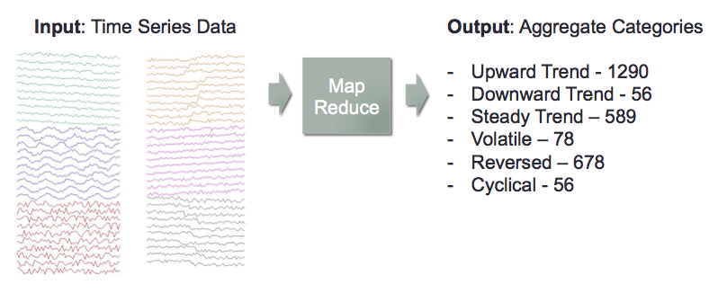
I used map reduce concepts my team to build a scalable model to categorize a large number or time series.

MOTIVATION

Time Series are tracked in many domains to monitor and detect macro trends and potential alerts.

  • Finance: stock prices, interest rate swap spreads can reveal trends in market sentiment
  • Retail: inventory levels and turnover can reveal trends in supply and demand.
  • Economic Policy: unemployment claims, sales data, payroll numbers reveal trends in the health of the economy.
  • Seismology: motion monitors can reveal imminent or recent activity which may prompt evacuation alerts

A large number and volume of individual time series data is available in each domain, but often aggregate views are required to better reveal broader trends

OBJECTIVE

Develop a map reduce program that takes in a large number of time series, and constructs aggregate statistics based on the individual time series’ categories.

Test Data Used: Synthetic Control .  It contains 600 time series each with 60 sequential observations.

Screen Shot 2015-12-30 at 12.04.14 PM

CATEGORIZATION APPROACH

Trend and Volatility

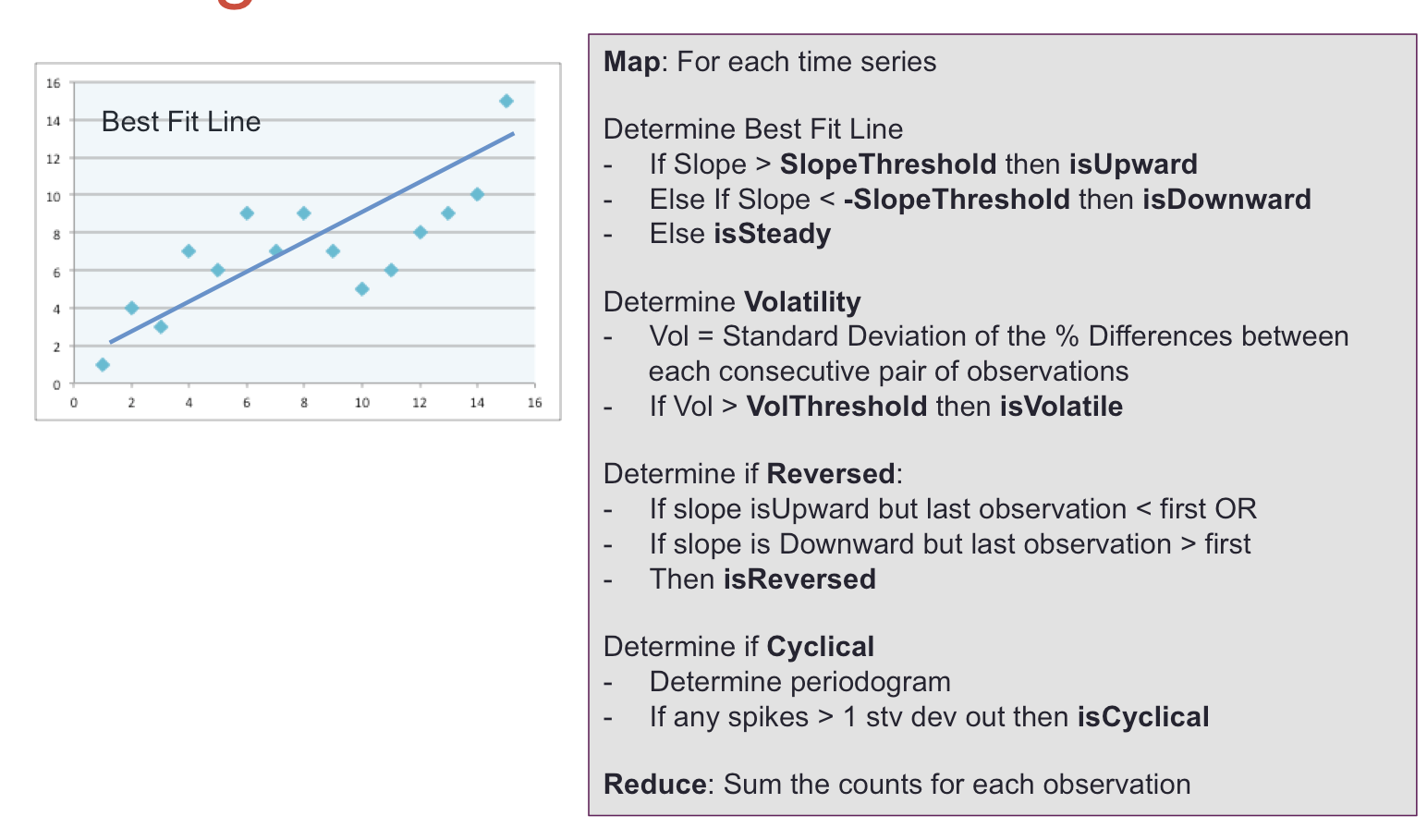
A straight best fit line was determined for each time series using scipy.optimize curve-fit.

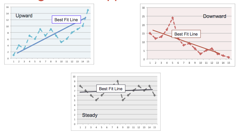
The slope of the line was used to determine whether it has an upward, downward or steady trend.  The threshold for a ‘positive’ slope is domain dependent, but for the test data was visually determined to be 0.25.

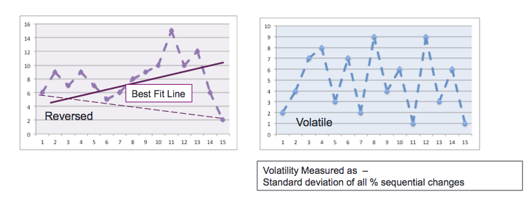
In addition, the difference between the first and last observation was compared to the slope of the best fit line to determine whether there was a reversal in trend.

Volatility for the entire time series was also measured by calculating the percent difference between each observation and the next, and then calculating the standard deviation of these differences.  The standard deviation was not normalized to a standard time range, as for example is done with stock price measurements, where the measurement of the time period is typically annualized.

Screen Shot 2015-12-30 at 12.07.38 PM Screen Shot 2015-12-30 at 12.07.46 PM

DETECTING CYCLICALITY

Utilization of a periodogram to detect cyclicality was also explored using a different set of manufactured data.

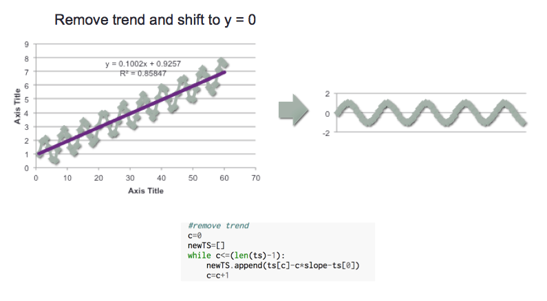
The first step is to remove any trend in the data and shift to zero.  This was done by using the slope of the best line determined in the prior step, and shifting the observation by the corresponding ‘rise over the run’ of the line.  NOTE: A different approach should be taken for time series where an exponential trend is observed.

Screen Shot 2015-12-30 at 12.07.55 PM

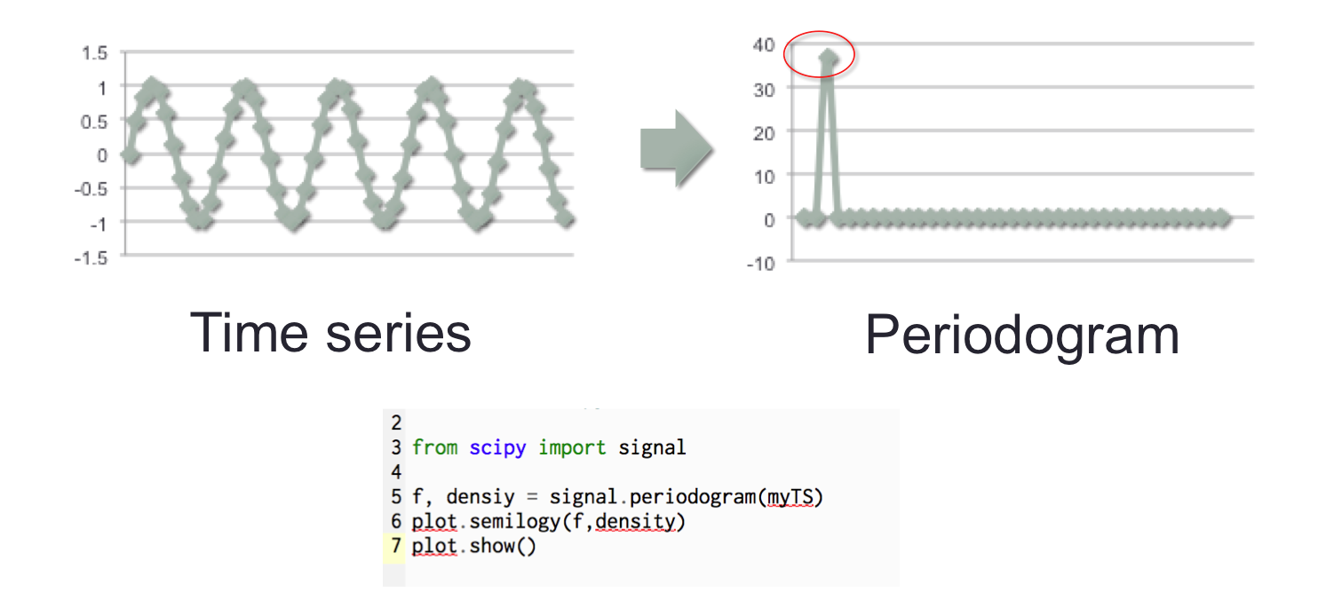
Once the trend is removed, scipy signal can be used to determine the Periodogram.  Below is an example for a simple sine curve.

The Periodogram is determined as follows

  • a Fast Fourier Transform is used to fit the time series to a sum of sine and cosine terms (i.e. transformed to be represented by a sinusoidal equation)
  • the dominant frequencies in that sinusoidal representation appear as spikes in the Periodogram; it can be conceptualized as a histogram of frequencies.

Screen Shot 2015-12-30 at 12.34.03 PM

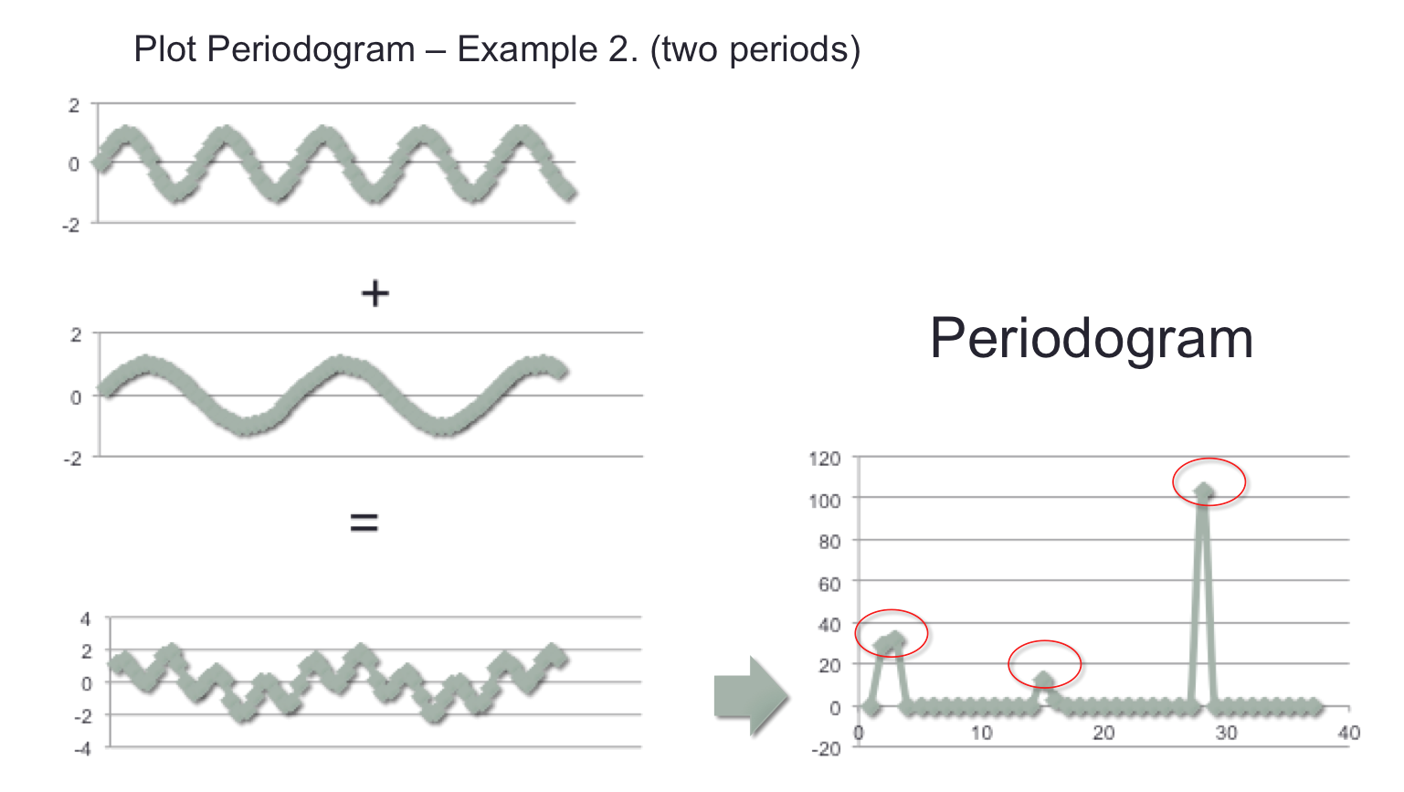
A second example was explored by taking 2 individual sine signals at different frequencies, and adding them together to create a third signal.  The periodogram of that third signal was then plotted, revealing the 2 dominant frequencies, plus a third less “intense” frequency.

Screen Shot 2015-12-30 at 12.34.16 PM

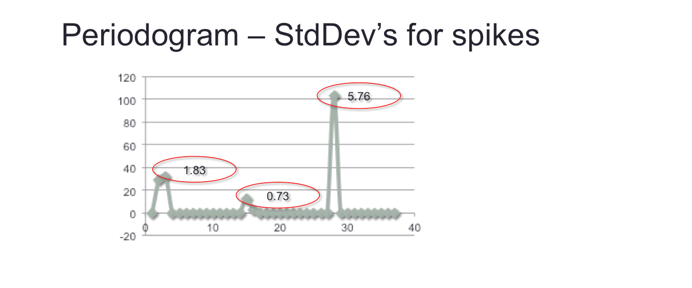
To programmatically detect these spikes, the number standard deviations of each was measured.  Spikes that are more than one standard deviation can be taken to represent the presence of dominant frequencies, and hence of cyclicality in the time series.

Screen Shot 2015-12-30 at 12.34.26 PM

Pseudo-Code

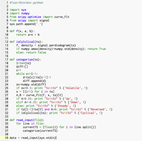
Screen Shot 2015-12-30 at 12.34.38 PM Python Code

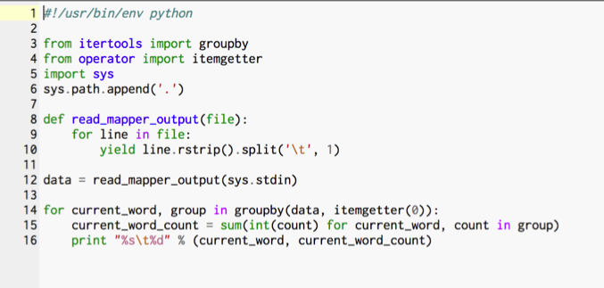
Python was chosen so that we could take advantage of the Hadoop streaming API which should provide for better scalability in terms of file processing and categorization.

Screen Shot 2015-12-30 at 12.08.34 PM

Screen Shot 2015-12-30 at 12.08.41 PM

UNIT TESTS on CLOUDERA

In order to baseline throughputs, runs were conducted on a stand alone desktop machine (1.8 GHz and 4 GB RAM), on a virtual machine environment running CentOS and Cloudera.

MapReduce Command:
hadoop jar /usr/lib/hadoop-0.20-mapreduce/contrib/streaming/hadoop-streaming-2.6.0-mr1-cdh5.4.2.jar \

-input /user/cloudera/TS/inputNew2 \
-ouput /user/cloudera/TS/output31 \
-mapper mapperTSCategoriesBU.py\
-reducer reduderTSCategories.py \
-file mapperTSCategoriesBU.py \
-file reduderTSCategories.py

Run Echo Sample …
15/11/17 17:33:33 INFO mapreduce Job: map 0% reduce 0%\

15/11/17 17:34:13 INFO mapreduce Job: map 6% reduce 0%

15/11/17 17:35:56 INFO mapreduce Job: map 100% reduce 27%

15/11/17 17:36:00 INFO mapreduce Job: map 100% reduce 100%

Map-Reduce Framework

Map input records= 9664

Map output records = 11872

Sample Output
>hadoop fs –cat TS/output/*

Down 2608

Reversed 480

Steady 4432

Up 2624

Volatile 1728

Variations Run

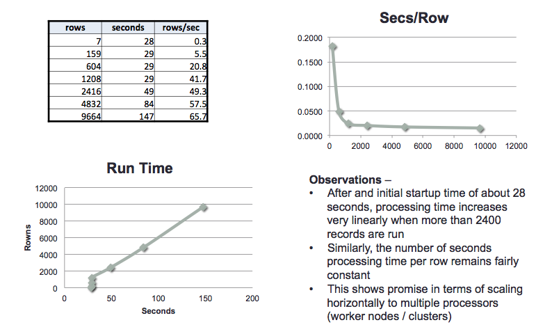
Runs were conducted with a different number of files to measure throughputs and run times with different input volumes

Screen Shot 2015-12-30 at 12.08.54 PM

Results

As expected, after an initialization minimum time of about 30 seconds, run times scale linearly with input volumes: throughputs also remain fairly constant even as higher input volumes are used.  This showed promise for scaling across multiple worker nodes.

Screen Shot 2015-12-30 at 12.09.01 PM

HDINSIGHT MULTI NODE RUNS

Experimental Design

To measure scalability utilizing multiple worker nodes, a trial version of Microsoft’s Azure HDInsight was used.

The experiments aimed to measure the effect of the following variables on throughput in terms of time series processed per second.

  • Number of worker nodes
  • Number of cores per worker node
  • Volume of input data

The graphic below represents the experiments we wished to run (highlighted in green), with the arrows representing the variation of a specific variable.

Screen Shot 2015-12-30 at 12.09.09 PM

HDInsight Graphical Interface

The screen shot below shows a portion of the graphical interface in Azure which was used to setup the Hadoop clusters, and vary the variables above.

Screen Shot 2015-12-30 at 12.09.21 PM

Results

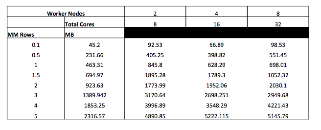
Results are shown below in terms of seconds per run, with varying input data volumes, and worker nodes.  A 4 core per worker node configuration was used for these runs.

While the throughouts achieved were much higher than in the single machine setup (around 1000 rows per second, vs. 65 in the single machine setup), we were not able to scale with the addition of worker nodes.

Due to time and subscription limitations we were not able to trouble shoot the issue.

Screen Shot 2015-12-30 at 12.09.32 PM

CONCLUSIONS

  • Python and related packages allow for relatively simple and compact code to check for a variety of time series characteristics
  • Cloudera runs show promise in terms of linear scalability
  • HDInsight’s graphical interface allows for quick and easy cluster setup, though credits are used quickly once the cluster is setup
  • Further work required to trouble shoot scaling in HDInsight

SNA – Centrality Measures and Visualization

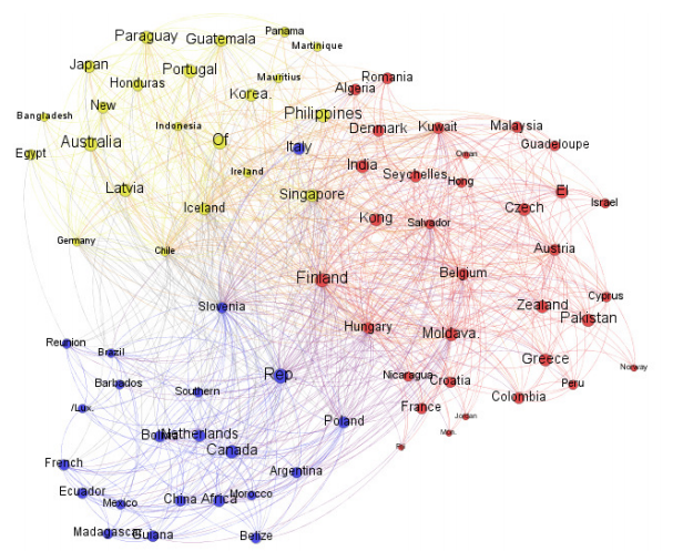
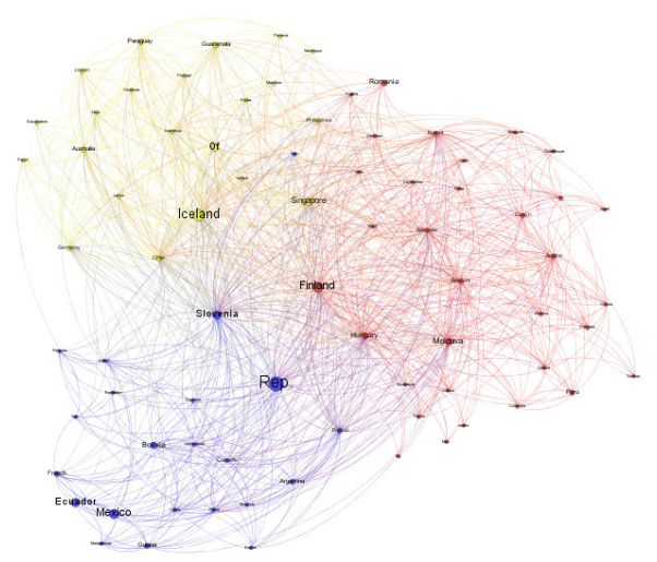
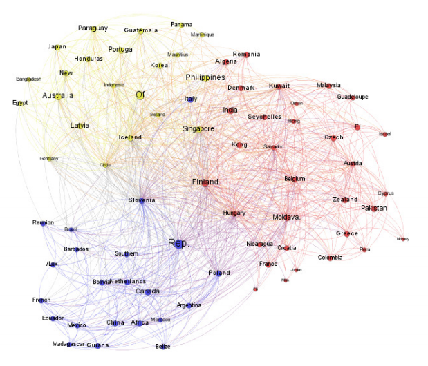
I imported data representing Metals trade (I believe, raw, processed or finished metal products) among a specific set of Countries from this source

The nodes represent countries and the directed edges represent imports from one country to another. The edges also have an Amount representing the value of the import / export

The data was in xml so converted it to csv before importing to Gephi

First I used Force Atlas 2 to layout the graph.  Then used Modularity to define a Cluster Class for each node and color coded them accordingly

Then I used different measures of centrality, represented by Node size:

1. Weighted Degree

Represents the number of connections (in bound and out bound) for each node, weighed by trade amount.  Hence in this view the countries with the most trading partners, taking into account the size of those trade relationships, are the largest ….

Weighed Degree

2. Eigenvector Centrality

This measures the importance of country’s trading relationships with other “important” metal trading countries. So for example Japan shows up with a higher ranking here than in the previous graph, presumably because it has trade with other important metal trading countries.  Slovenia shows as smaller, perhaps because it has many trading partners that do not rank high in Metal trading

Eigenvector Centrality

3. Betweenness Centrality –

This measures the degree to which a node is in the shortest path between all other pairs of nodes in the graph.  For trading it can be viewed as how important is that country in the flow of trade among other countries assuming a metal or its derivatives may make multiple hops between countries.

Betweenness Centrality

4. Closeness Centrality

Measures how close a node is to every other node. For trading it can be viewed as how few trading hops are needed to trade with another country with whom it does not trade directly – again assuming a metal or its derivatives may make multiple hops between countries.  Here for example Latvia shows quite small, my interpretation meaning it is far from many other countries in terms of trading hops.

Closeness Centrality


SNA – Visualization Exercise

I am experimenting with Gephi, a visualization tool for graphs / networks.

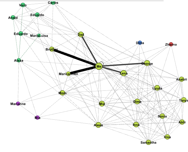
I loaded a subset of my family and the relationships between us and among them.

First the graph was laid out using the Force Atlas mechanism available in Gephi.

The size of each node was made proportional to its Degree after running Average Degree statistics.

I color coded the nodes to represent country of residence (US, Mexico, Germany, Russia, Armenia).

Here is the result :

Family Graph 1 The outer regions or nodes represent either kids or relatives for whom I have not entered further relationships to their/our other relatives.
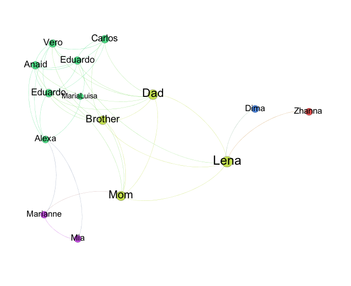
A prettier version of the left part of the graph is shown below:

Family Graph 2


Predictive Analytics: Market Data

Monthly Buy / Hold / Sell Recommendations

Dow Jones Industrial Average Index

Objective

In order to explore usage in R of machine learning and predictive packages:

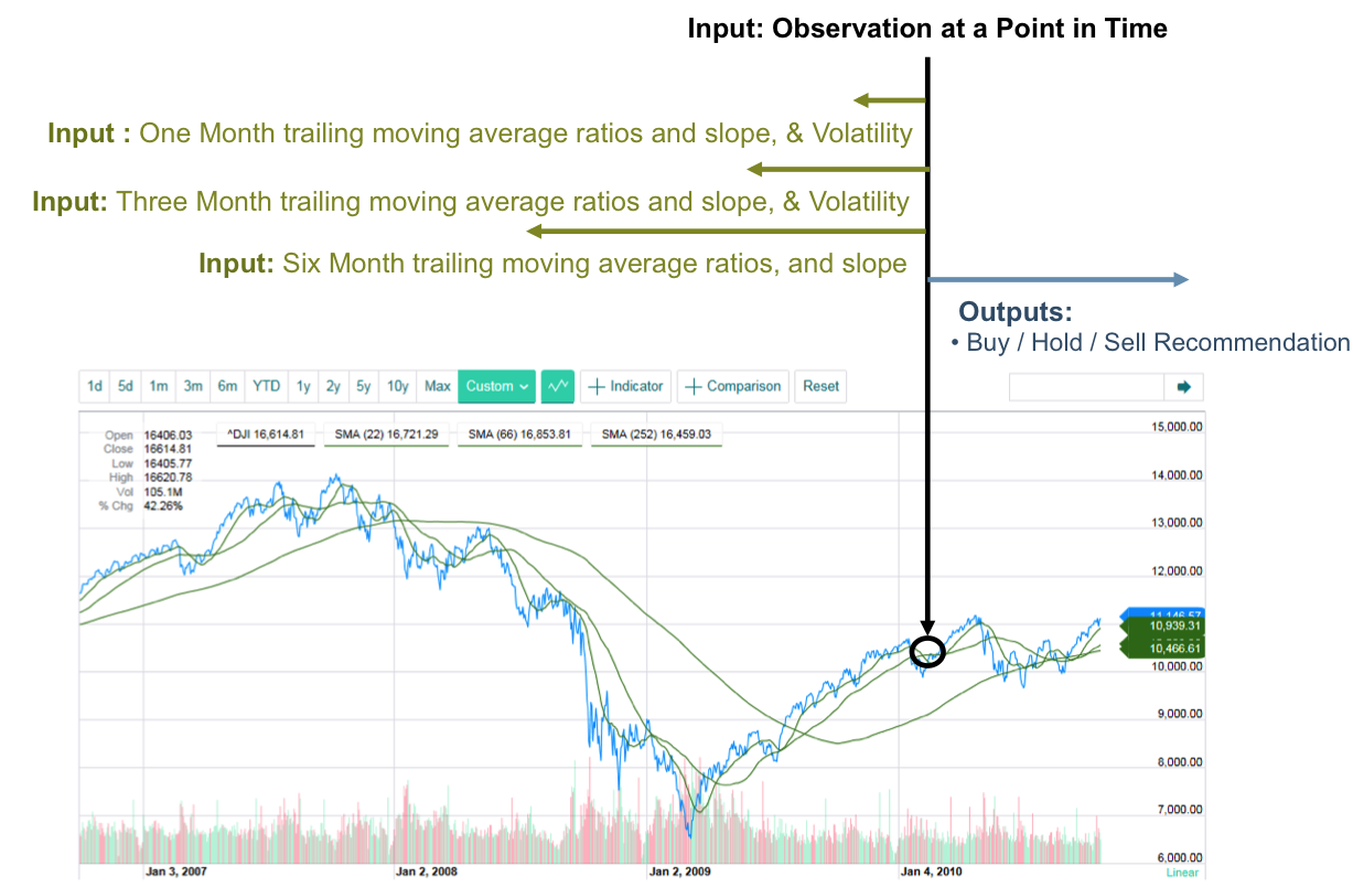
  • Develop model that, for a specific observation of current indicators of the Dow Jones Industrial Average (DJIA) index, recommends whether to Buy / Hold / Sell DJIA index.
  • The target audience is a Retail investor who may have restrictions in terms of frequent trading and should have longer time horizons in mind (i.e. no day trading) … hence the time horizon of the recommendation is in the order of Monthly /Quarterly.

Packages used: kmeansC5.0neuralnet

Background

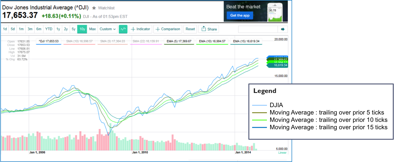
The chart below shows the closing price of the Dow Jones industrial average over the last decade:

DJ 1 History

We will use technical indicators (i.e. no macro economic indicators) with the assumption that the price history and pattern reflect the ‘crowd’s’ reaction, in terms of buying and selling, to geo-political and macro economic events.  Another assumption is that the ‘crowd’s’ psychology does not significantly change over time, so that historical patterns in the price movement of the index reflect that ‘crowd’ psychology and hence can predict where the ‘crowd’ is going next

Key Indicators

Key Indicators used as inputs to the model:

Moving Averages, slopes and ratios among these – an indication of trends

-Observed Volatilities – an indication of fear or uncertainty

Output variable for machine learning:

-For training purposes, output variable – > observed forward Returns

DJ 2 Indicators

This approach is (purposefully) different from traditional technical analysis -using indicators readily calculated from the time series – as opposed to techniques which use indicators such as support and breakout levels.

Moving Averages

  • Help smooth the signal – and understand trend
  • Reduce noise; However, “noise” is an important Indicator – see Volatility as a separate indicator
  • Exponential moving averages (EMA) weigh recent observations more heavily so will be used instead of simple moving average
  • From experience will use 21, 63 and 126 trading days as the Moving Average windows

DJ 3 MA

Dj 4 MA

Input and Output Variables

DJ 5 Input Variables

Sample R Snippets

Calculate EMAs ->

EMA21XTS<-EMA(closesXTS, n = 21)

Calculate EMA Indexes (i.e. ratio of EMA relative to actual Close)

djiaEMA$EMA126_I <- djiaEMA$EMA126/djia$Close

djiaEMA$EMA63_I <- djiaEMA$EMA63/djia$Close

djiaEMA$EMA21_I <- djiaEMA$EMA21/djia$Close

Calculate slope of 21 day exponential moving average->

djiaEMA<-data.frame(Date=index(djiaZEMA),djiaZEMA,row.names=NULL)

L<-length(djiaEMA$Close)

for (i in 31:L) {

djiaEMA$EMA21_Sl[i]=(as.numeric(djiaEMA$EMA21[i])-as.numeric(djiaEMA$EMA21[i-10]))/10

}

Plot EMAs and Slopes

par(mfrow=c(2,1))

tsRainbow <- rainbow(3)

plot(djiaZEMASl[32000:34000,c(15,16,17)], col = tsRainbow, screens=1, xlab =”Date”, ylab=”Levels”)

legend(“topleft”, title = “Levels”, col = tsRainbow, pch = 20, legend=c(names(djiaZEMASl[,c(15,16,17)])))

plot(djiaZEMASl[32000:34000,c(9,10,11)], col = tsRainbow, screens=1, xlab =”Date”, ylab=”Levels”)

legend(“topleft”, title = “Levels”, col = tsRainbow, pch = 20, legend=c(names(djiaZEMASl[,c(9,10,11)])))

EMAsDJ Snipper EMAs

Slopes

DJ Snippers Slopws

Index Levels
DJ Snippets Slopws

Models Used

kMeans Cluster

As part of the data understanding phase, run a kMeans Clustering analysis to understand whether it reveals any interesting patterns

Decision tree

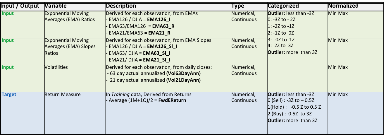
  • For efficiency, translated continuous inputs and target variable into categorical values
  • Built decision tree with training data
  • Tested with test data and tuned
  • Used to predict results with validation data; Measured classification error rates

Neural Network

  • To calculate Next Month’s predicted return
  • Normalized inputs and target variables using Min Max (0 to 1)
  • Measured prediction errors on testing set and validation set

Use of Models – Back Testing (not in scope for this project)

The true test of the models would be to back test the recommendations’ cumulative returns over a time period and compare those to the returns an investor would realize if the just ‘Held’ DJIA, which would be the control measure

Data Preparation

Sample raw data – >

DJ 6 raw

Data categorized ->

DJ 6 cat

Data min-max normalized ->

DJ 6 Min Max

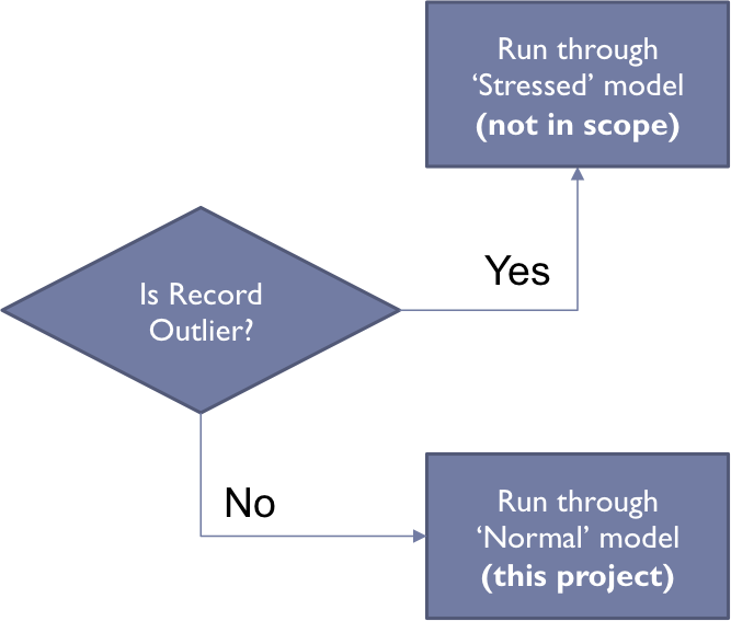
Outliers

Records with outliers in any of the input or target variables will be excluded

  • Moving Averages
  • Volatilities
  • Returns

Z Scores used to detect outliers: < – 3Z or > 3Z

Outliers do not represent ‘incorrect’ data points, but times of extreme stress or euphoria in the markets. These would be modeled separately as these market events represent the greatest times of risk / opportunity (out of scope)

Dj 7 outliers

Sample R Snippets

Categorize by Z Score

L<-length(djia$Close)

myVarZ<- djia$FwdEReturnZ

myVarCat<- rep(0,L)

for (i in 1:L)

{

if (myVarZ[i]<(-3)){myVarCat[i]=0} else

{ if (myVarZ[i]<(-2)) {myVarCat[i]=1} else

{ if (myVarZ[i]<(-1)) {myVarCat[i]=2} else

   { if (myVarZ[i]<(0)) {myVarCat[i]=3} else

   { if (myVarZ[i]<(1)) {myVarCat[i]=4} else

   { if (myVarZ[i]<(2)) {myVarCat[i]=5} else

     { if (myVarZ[i]<(3)) {myVarCat[i]=6} else

     { myVarCat[i] = 7 }

     }

     }

   }

   }

}

}

}

djia$FwdEReturn_Cat<- rep(0,L)

djia$FwdEReturn_Cat<-myVarCat

Remove Outliers

myOutlierIndexFwdRet <- which(djia$FwdEReturnZ<(-3) | djia$FwdEReturnZ>(3))

djiaNoOutliers <- djia[-myOutlierIndex, ]

kMeans Clustering

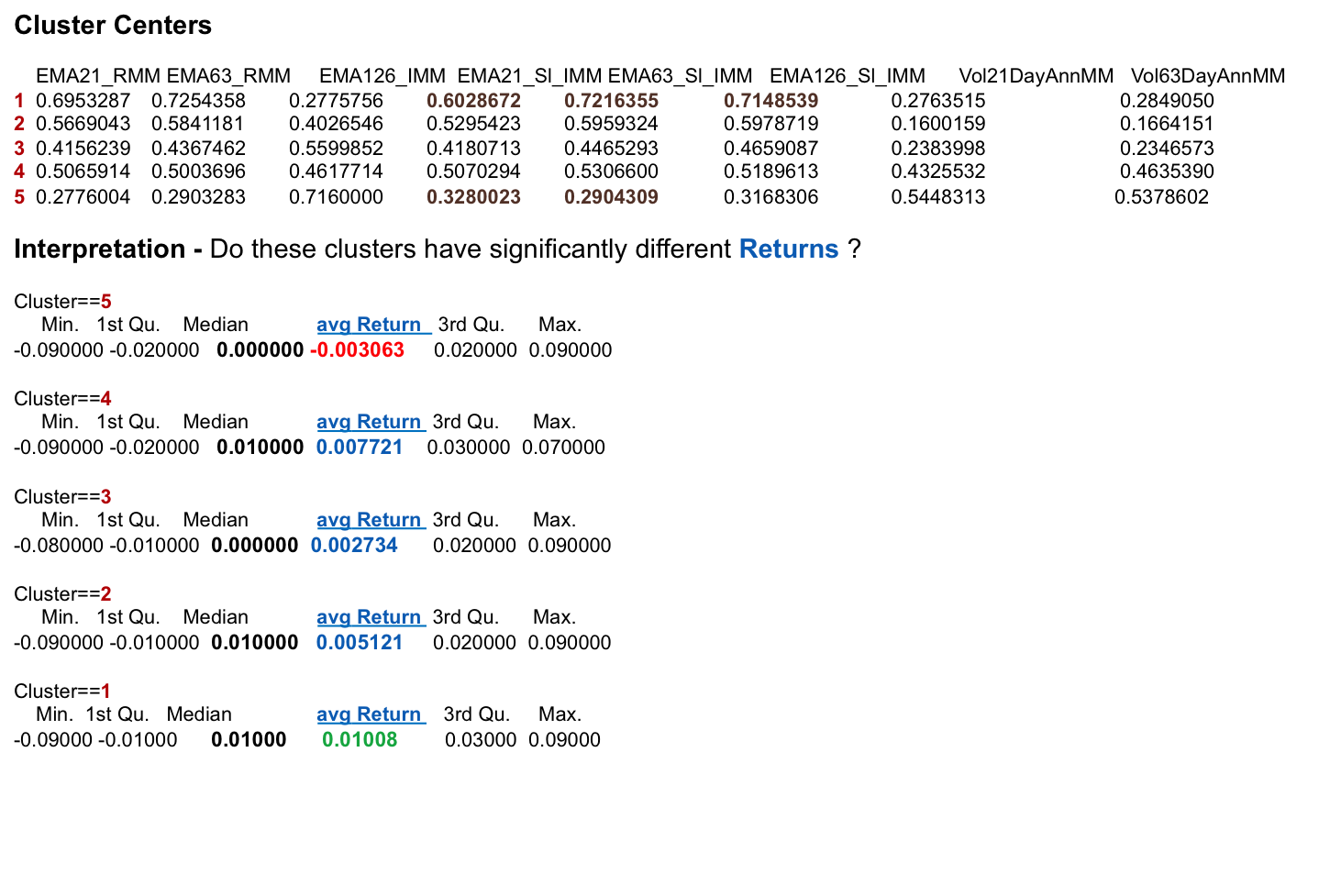
As part of the data understanding phase, I ran a kMeans Clustering analysis to understand whether it would reveal any interesting patterns.  Used the R kmeans function with k = 5 on the entire monthly data set

Sample R Snippet

djiaKMeans<-djiaM[,c(“EMA21_RMM”,”EMA63_RMM”,”EMA126_IMM”,”EMA21_Sl_IMM”,”EMA63_Sl_IMM”,”EMA126_Sl_IMM”,”Vol21DayAnnMM”,”Vol63DayAnnMM”)]

km<-kmeans(djiaKMeans,centers=5)

Observations & Conclusions

dj 8 centers

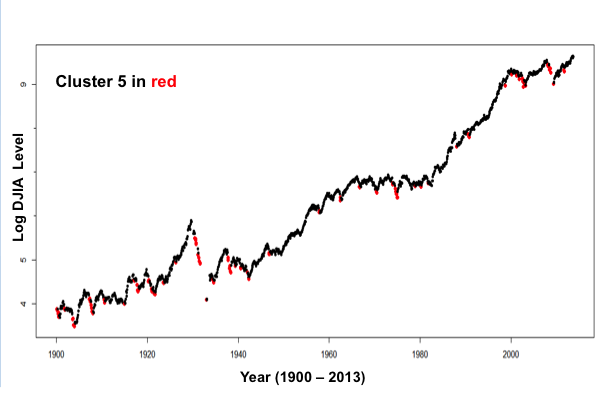
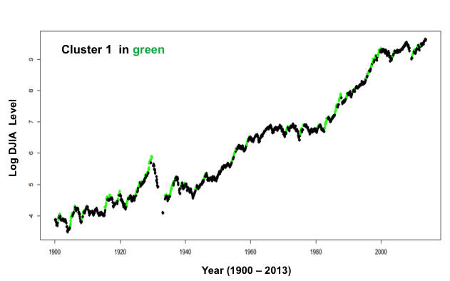
  • Cluster ‘5’ corresponded to negative returns while Cluster 1 corresponded to the highest returns
  • When plotted, Cluster ‘5’ corresponded to in many cases, sell signals, while Cluster 1 corresponded to in many cases to buy signals

Data points in Cluster 5 shown in Red

plot(djiaM$Date,log(djiaM$Close),col=ifelse(djiaM$Clusters!=5,”black”,”red”),pch=ifelse(djiaM$Clusters==5,16,20))


FJ 8 Red


Data points in Cluster 1 shown in Green –

plot(djiaM$Date,log(djiaM$Close),col=ifelse(djiaM$Clusters==1,”green”,”black”),pch=16)

DJ 8 k Green

DJ 8 k both
The resulting k-centers may be used for new observations – i.e. observe which single cluster the new observation is closest to and from that categorize which market condition it belongs to. This could then be used to signal entry and exit points from the market – for example ‘3 consecutive green clusters signal entry, three consecutive red clusters signal exit, alternating red and green mean hold

Decision Tree

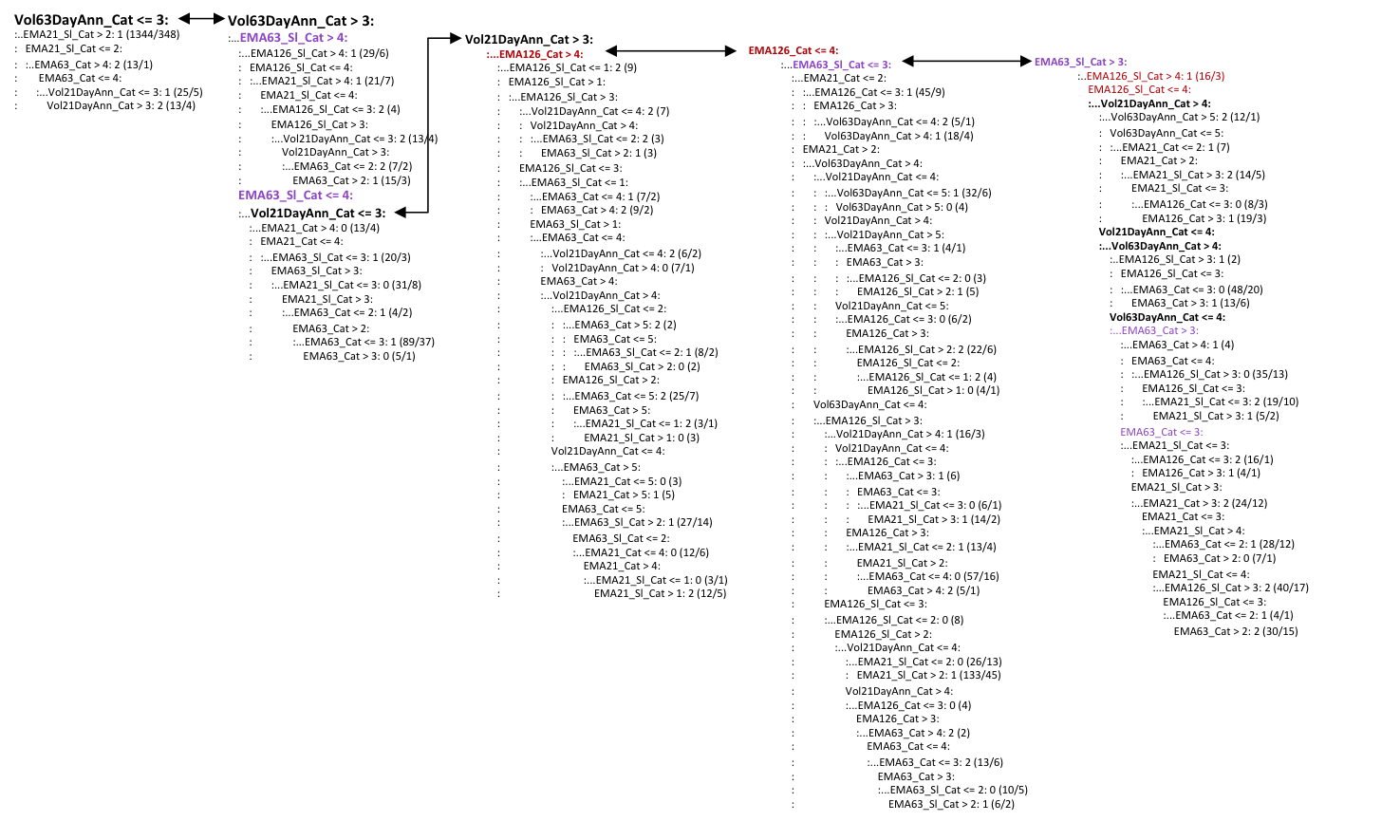
  • Trained and tuned a set of decision trees using C50 (using the R C50 package)
  • Tried different time periods, training and test data sets, and classification schemes for target variable
  • The chosen decision tree was used to predict Buy | Hold | Sell recommendations for the Validation data
  • A key finding in the tuning step was that the decision tree for each ‘era’ (e.g. ‘80’s vs. ‘30’s) was significantly different and of significantly different complexities. Even the most complex trees however were built quickly (within a second)

Sample R Snippets

Train Decision Tree

djiaRTInput<-djiaM[,c(“EMA21_Cat”,”EMA63_Cat”,”EMA126_Cat”,”EMA21_Sl_Cat”,”EMA63_Sl_Cat”,”EMA126_Sl_Cat”, “Vol21DayAnn_Cat”,”Vol63DayAnn_Cat”)]

djiaRTTrain<-factor(djiaM$FwdEReturn_CatS) 

c50fit<-C5.0(djiaRTInput, djiaRTTrain)

summary(c50fit)

dj9 tree

Attribute Usage — (for period 1999 – 2013)

  •      100.00% Vol63Day
  •        79.03% EMA21_Slope
  •        46.92% EMA63_Slope
  •        46.31% Vol21Day
  •        37.37% EMA126_Index
  •        36.42% EMA126_Slops
  •        32.31% EMA21_Index
  •        27.13% EMA63_Index\

Size (decision rule set ): 84

Error Rates:

  • 28% on Training data
  • 31% on Validation data

Predict with Resulting Decision Tree

valInData<-djiaM[,c(“EMA21_Cat”,”EMA63_Cat”,”EMA126_Cat”,”EMA21_Sl_Cat”,”EMA63_Sl_Cat”,”EMA126_Sl_Cat”, “Vol21DayAnn_Cat”,”Vol63DayAnn_Cat”)]

treeRecommend<-predict(c50fit,valInData,type=”class”)

Compare Predictions with Actuals

valOutData<-factor(djiaM$FwdReturn_CatS)

sum(treeRecommend == valOutData)/length(treeRecommend)

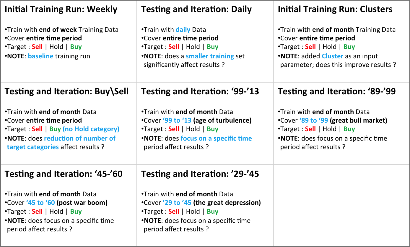
Tuning Iterations

dj 9 tuning

  • Larger (i.e. daily) training set resulted in more accurate decision tree
  • Introducing Cluster simplified the decision tree but did not improve accuracy
  • Simplifying the target variable categorization simplified the decision tree however reduced accuracy
  • Each ‘era’ requires a different decision tree
  • Attribute usage varies but the following appear to be the most important in most models: 63 day volatility, 126 day Index and slope
  • Speed of prediction computations was within 1 second regardless of decision tree complexity

Results and Conclusions

The 1999 – 2013 “era” data was used as input to the tuned decision tree to determine accuracy of predictions …

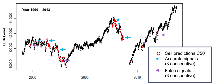
dj 9 c50 sell


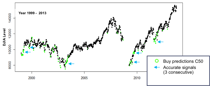
dj 9 c50 buy

  • Though a lower error rate is desirable, the decision tree made reasonably accurate predictions to buy or sell per the charts to the right, though there were some false buy / sell signals
  • Similar to the kMeans cluster analysis, Buy / Sell decisions . should be made based on a series of consecutive consistent predictions from the model – for example ‘3 consecutive buy recommendations signal entry, three consecutive sell recommendations signal exit
  • Bottoms seem to have conflicting Buy / Sell signals

Neural Network

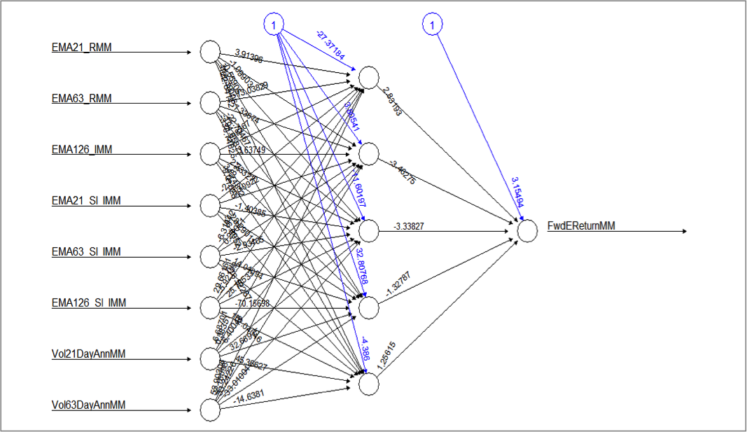
  • The R package neuralnet was used
  • Input parameters and target parameters, once outliers were extracted, were MinMax normalized
  • Tested and iterated with testing data
  • Ran and plotted results with validation data
  • Since the C50 results demonstrated that each ‘era’ has very different characteristics, I focused on modeling and validating the time period 1999 – 2013

dj 10 NN inputs

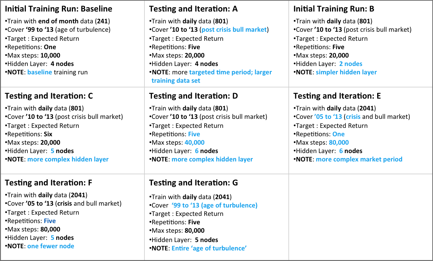
Tuning Approach

Tried different runs, varying

  • Time period of training data
  • Number of neurons in hidden layer
  • Number of repetitions for a specific configuration
  • Max number of steps per repetition

Measured error rate as follows

  • With weights resulting for a specific configuration of the model, predict forward returns with test data
  • Measure / observe
    • ¨Error rate and distribution of predictions – > Error % = (predicted value – actual value) / actual value
    • ¨Distribution of predictions – > do these match distribution of actuals in terms of min / max / mean ?

Chose model with average lowest error %’s and prediction distribution closest to actual

dj 10 tuning iterations

Sample R Snippets

Train the Network with Training Data

library(neuralnet)

djiaNNInput <- djia[1152:1323,c(“EMA21_RMM”,”EMA63_RMM”,”EMA126_IMM”,”EMA21_Sl_IMM”,”EMA63_Sl_IMM”,”EMA126_Sl_IMM”, “Vol21DayAnnMM”,”Vol63DayAnnMM”,”FwdEReturnMM”)]

print(net.dat<-neuralnet(formula =

   FwdEReturnMM~ EMA21_RMM + EMA63_RMM + EMA126_IMM

                 + EMA21_Sl_IMM + EMA63_Sl_IMM + EMA126_Sl_IMM

                 + Vol21DayAnnMM + Vol63DayAnnMM,

                data=djiaNNDInput, rep = 1, hidden = 5, stepmax = 20000,

                linear.output=FALSE))

plot(net.dat, rep = “best”)

dj 10 NN plot

Making predictions with generated neural network

djiaNNVal<- djiaV[1595:1835,c(“EMA21_RMM”,”EMA63_RMM”,”EMA126_IMM”,”EMA21_Sl_IMM”,”EMA63_Sl_IMM”,”EMA126_Sl_IMM”, “Vol21DayAnnMM”,”Vol63DayAnnMM”)]

NNtest<-compute(net.dat, djiaNNVal, rep = XBEST)

djiaV$NNPredict[1595:1835]<- NNtest$net.result

Preliminary Results

The neural network shown above was chosen from different configurations tested with test data. It was trained with training data from a daily set of observations from 1999 through 2013

The validation data was then input to the NN and predictions computed

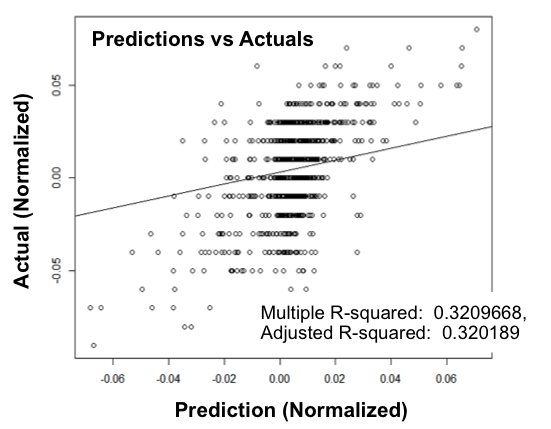
The predictions were plotted against the actuals on the plot and a best fit line drawn

dj 10 bestfit

If the predictions are 100 % accurate we would see a diagonal straight line.  The plot does not show a very close correlation of predicted to actual.

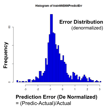
The errors were then computed across the validation data and plotted on the histogram on the right

Error = (PredictedReturn / Actual Return) / ActualReturn

fj 10 histo

The histogram shows significant levels of errors, tending to underestimate the actual

Preliminary Conclusion ; this NN does not accurately predict expected results. HOWEVER I next looked at the results in a different way ->

Interpreting NN Results As Signals

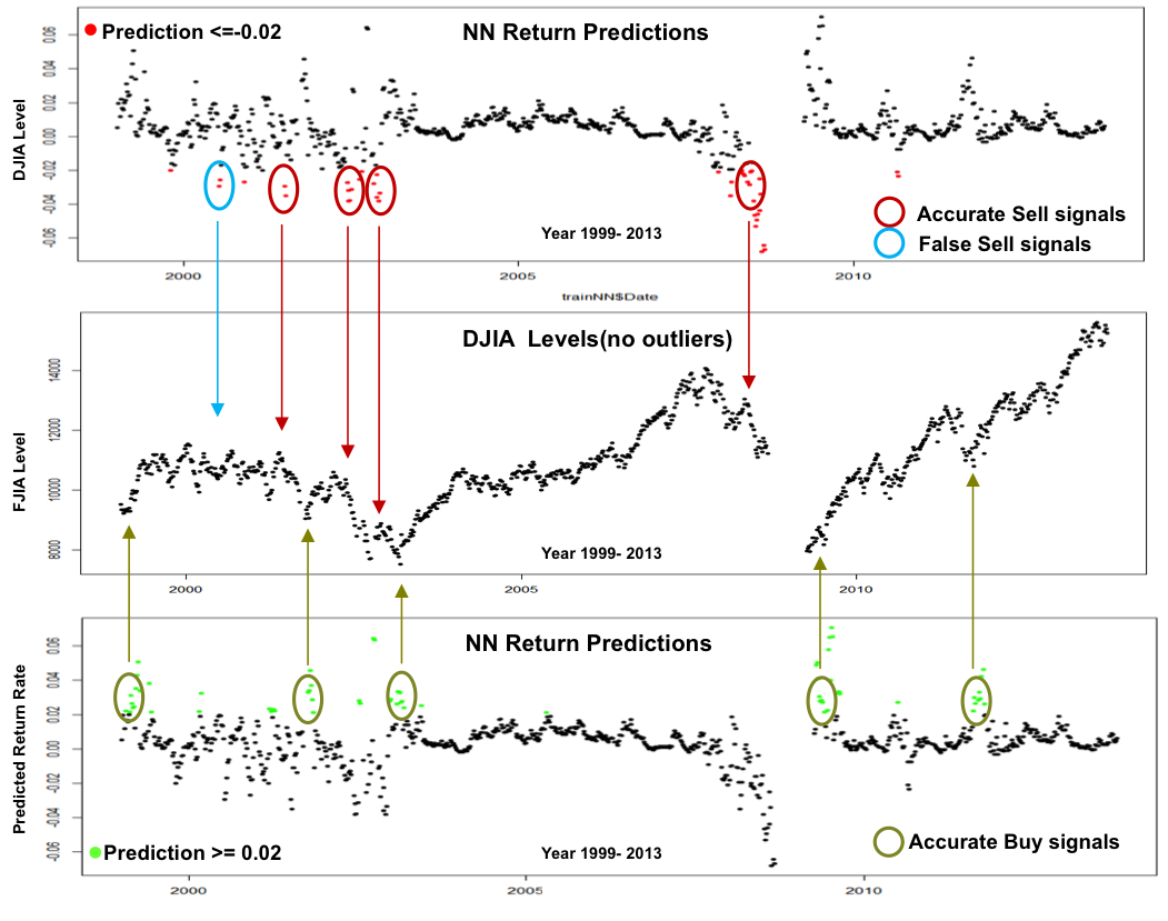
Since the actual Return predictions of the NN proved disappointing, the predicted Returns were plotted as time series to confirm how they related to the actual DJIA index

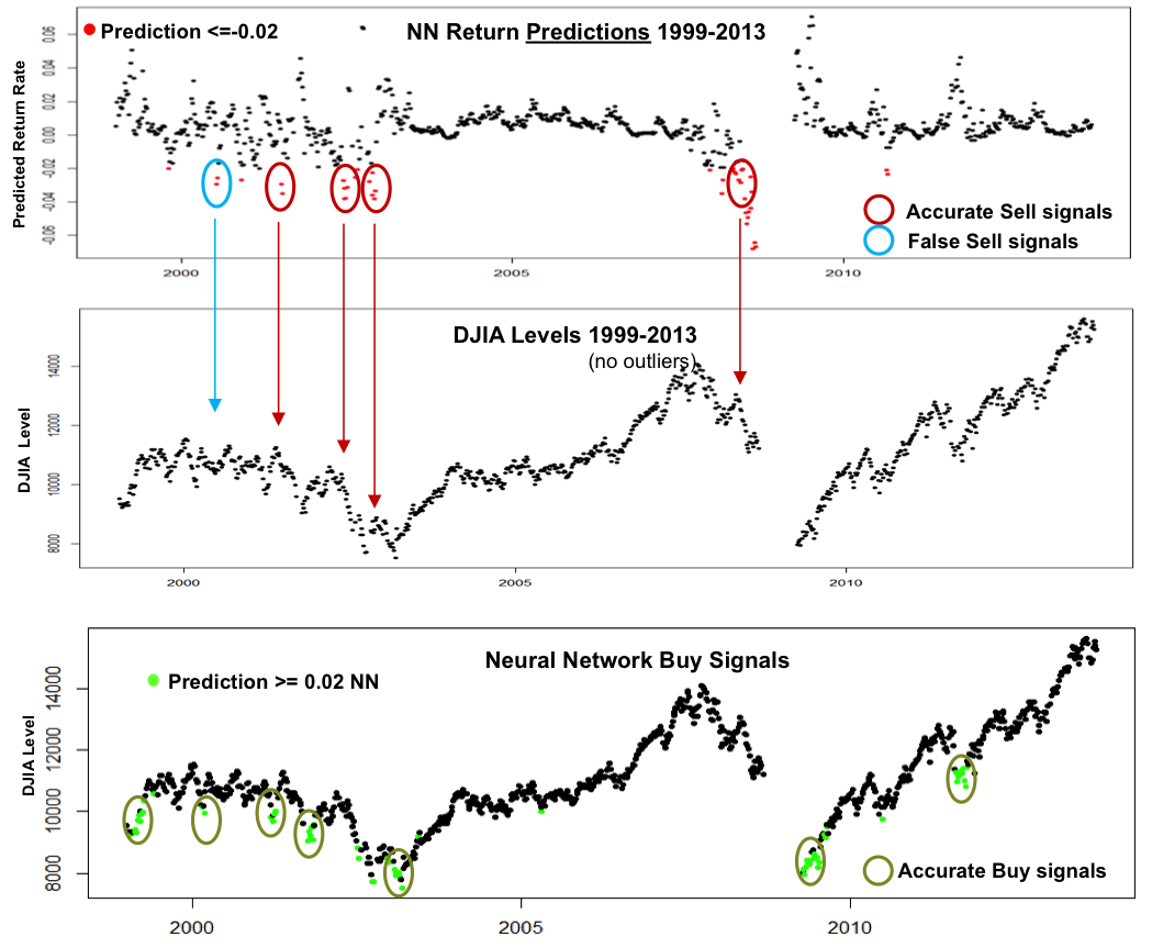
dj 10 NN Signals

The plot on the top has predicted results and in Red highlights those that are less than 0.02.

The plot on the bottom has predicted results and in Green highlights those that higher than 0.02.

The plots below illustrate this

Conclusions

Setting Predicted Return <= 0.02 as a a Buy Signal generated fairly accurate signals, especially if the signals occur in sequence over a small period of time

Setting Predicted Return <= -0.02 as a Sell signal generated mostly accurate Sell signals, especially if the signals occur in sequence over a small period of time

The shape of the predictions plot compared to the DJIA plot shows promise – further tuning may yield better predictions

dj 10 results

Overall Conclusions

  • C50 did a reasonable job of raising Sell and Buy signals, better with Buys
  • NN did not do a good job of predicting returns but did better in raising Buy / Sell signals – especially Buy signals
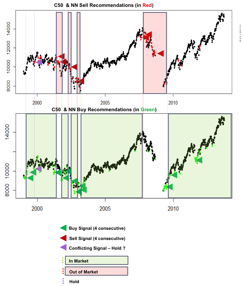
  • The charts below show a different view of the signals. The C50 and NN Sell and Buy signals are shown in one plot, and Signals identified when there are 4 or more consecutive consistent predictions

dj 11 all

  • Based on these signals, entry and exit points are shown, with shaded areas for signals to be In the market and Out of the market
  • The combination of models make a very good job of identifying when to be in the market and when to be out

Next Steps

So am I now sipping margaritas and retired in my private Tahitian Island?  Unfortunately not.  I briefly used the models on recent market data with mixed results.  Why ?  I probably overtrained the models, but I think they show promise ; )

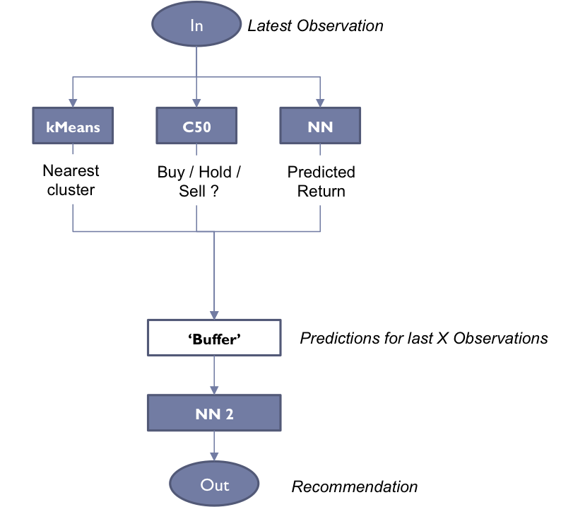
  • Create a predictive model that takes in as input a series of signals from the other models to trigger an entry or exit from the market
  • Back test the model

dj 12 next steps

Check out the project here : Class 637 Project Submission Fall 2014 v3