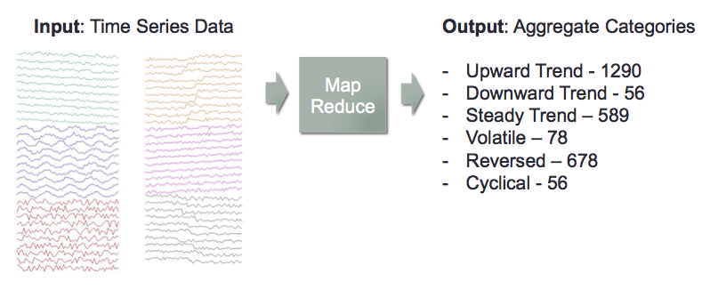
I used map reduce concepts my team to build a scalable model to categorize a large number or time series.
MOTIVATION
Time Series are tracked in many domains to monitor and detect macro trends and potential alerts.
- Finance: stock prices, interest rate swap spreads can reveal trends in market sentiment
- Retail: inventory levels and turnover can reveal trends in supply and demand.
- Economic Policy: unemployment claims, sales data, payroll numbers reveal trends in the health of the economy.
- Seismology: motion monitors can reveal imminent or recent activity which may prompt evacuation alerts
A large number and volume of individual time series data is available in each domain, but often aggregate views are required to better reveal broader trends
OBJECTIVE
Develop a map reduce program that takes in a large number of time series, and constructs aggregate statistics based on the individual time series’ categories.
Test Data Used: Synthetic Control . It contains 600 time series each with 60 sequential observations.
CATEGORIZATION APPROACH
Trend and Volatility
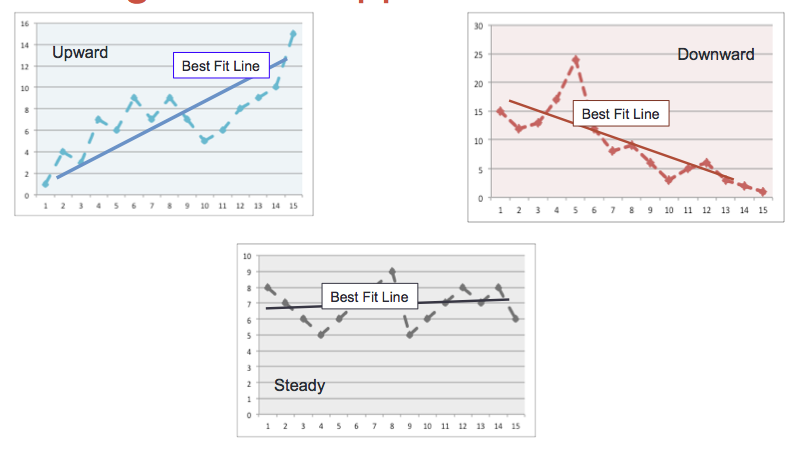
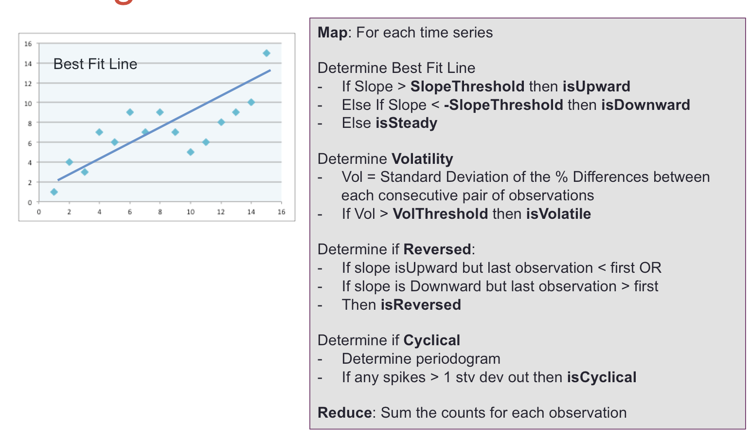
A straight best fit line was determined for each time series using scipy.optimize curve-fit.
The slope of the line was used to determine whether it has an upward, downward or steady trend. The threshold for a ‘positive’ slope is domain dependent, but for the test data was visually determined to be 0.25.
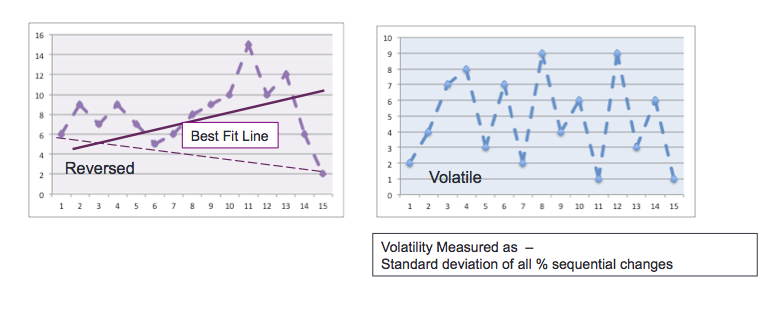
In addition, the difference between the first and last observation was compared to the slope of the best fit line to determine whether there was a reversal in trend.
Volatility for the entire time series was also measured by calculating the percent difference between each observation and the next, and then calculating the standard deviation of these differences. The standard deviation was not normalized to a standard time range, as for example is done with stock price measurements, where the measurement of the time period is typically annualized.
DETECTING CYCLICALITY
Utilization of a periodogram to detect cyclicality was also explored using a different set of manufactured data.
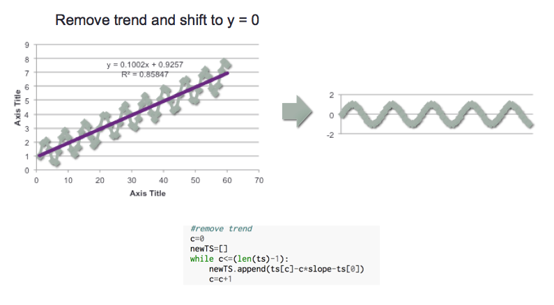
The first step is to remove any trend in the data and shift to zero. This was done by using the slope of the best line determined in the prior step, and shifting the observation by the corresponding ‘rise over the run’ of the line. NOTE: A different approach should be taken for time series where an exponential trend is observed.
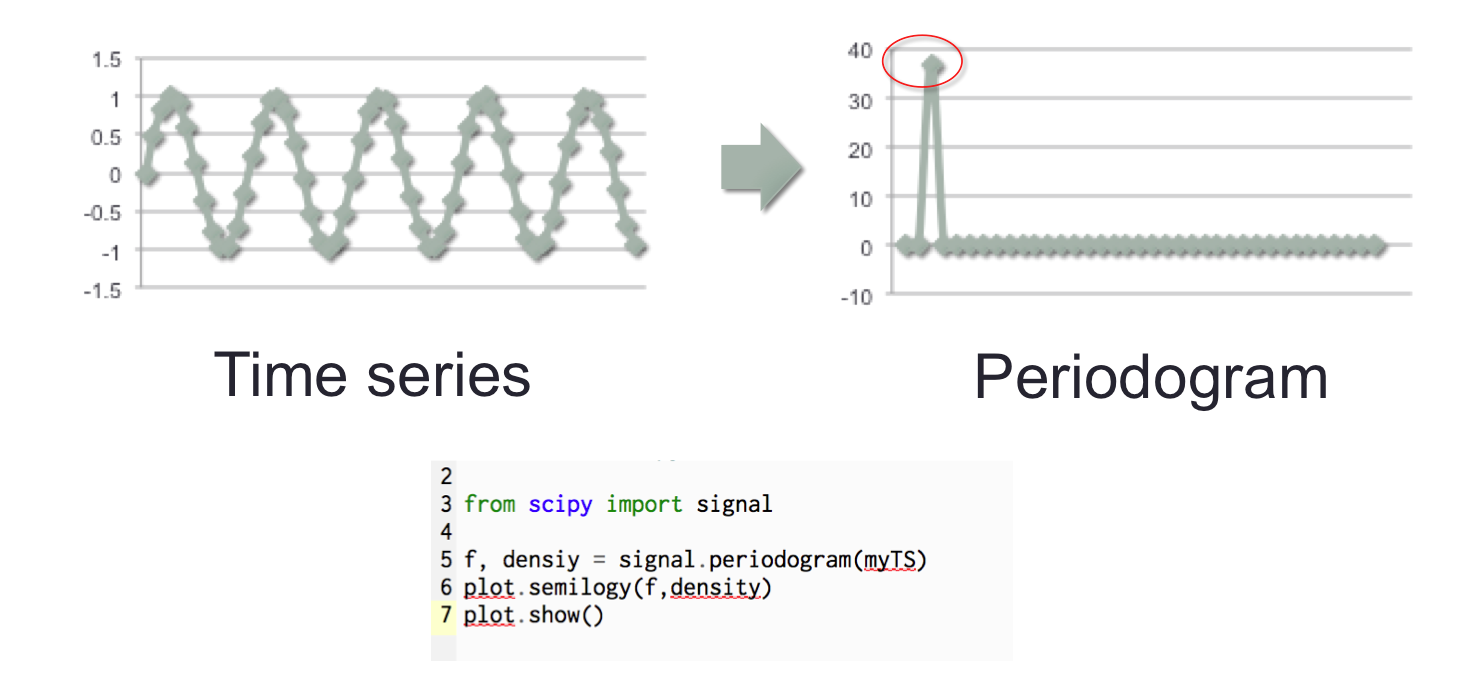
Once the trend is removed, scipy signal can be used to determine the Periodogram. Below is an example for a simple sine curve.
The Periodogram is determined as follows
- a Fast Fourier Transform is used to fit the time series to a sum of sine and cosine terms (i.e. transformed to be represented by a sinusoidal equation)
- the dominant frequencies in that sinusoidal representation appear as spikes in the Periodogram; it can be conceptualized as a histogram of frequencies.
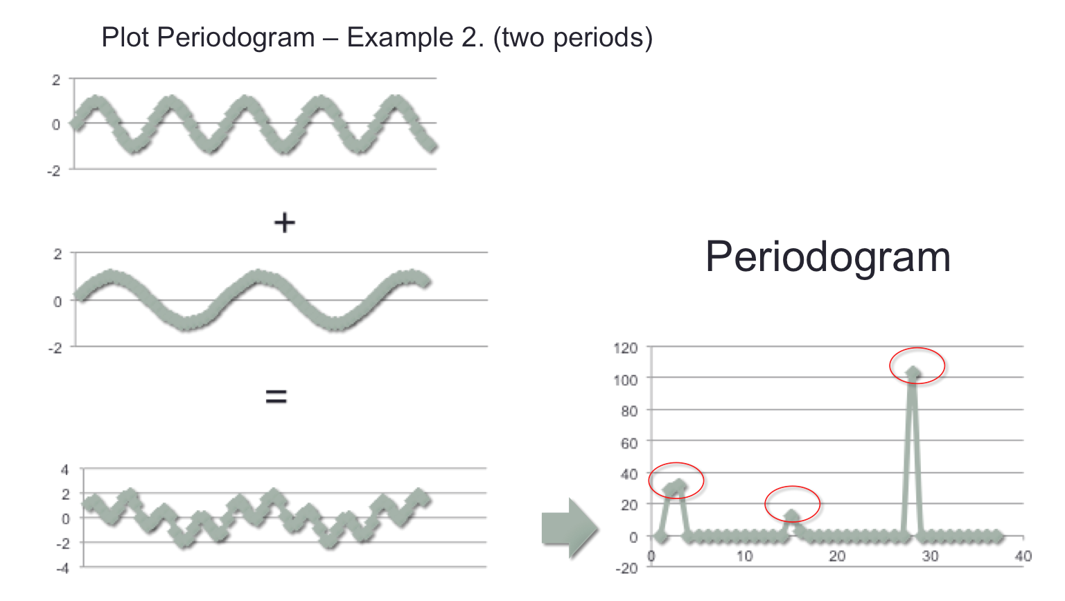
A second example was explored by taking 2 individual sine signals at different frequencies, and adding them together to create a third signal. The periodogram of that third signal was then plotted, revealing the 2 dominant frequencies, plus a third less “intense” frequency.
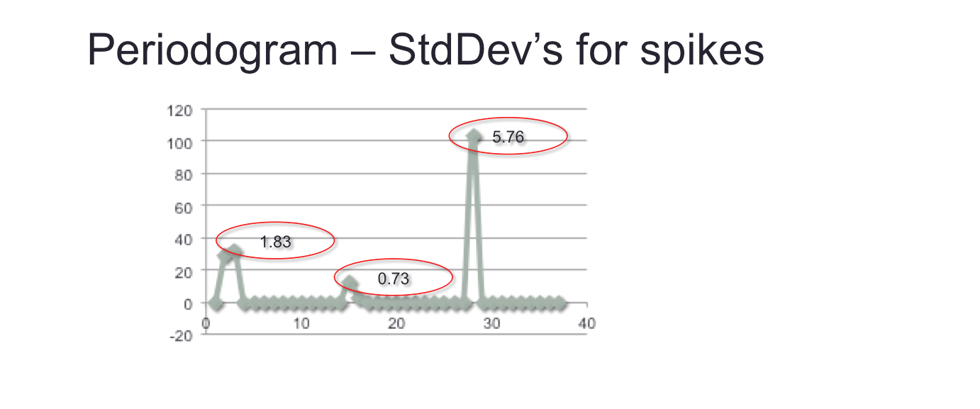
To programmatically detect these spikes, the number standard deviations of each was measured. Spikes that are more than one standard deviation can be taken to represent the presence of dominant frequencies, and hence of cyclicality in the time series.
Pseudo-Code
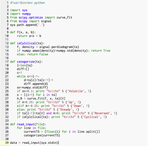
 Python Code
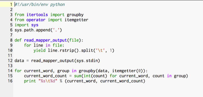
Python was chosen so that we could take advantage of the Hadoop streaming API which should provide for better scalability in terms of file processing and categorization.
UNIT TESTS on CLOUDERA
In order to baseline throughputs, runs were conducted on a stand alone desktop machine (1.8 GHz and 4 GB RAM), on a virtual machine environment running CentOS and Cloudera.
MapReduce Command:
hadoop jar /usr/lib/hadoop-0.20-mapreduce/contrib/streaming/hadoop-streaming-2.6.0-mr1-cdh5.4.2.jar \
-input /user/cloudera/TS/inputNew2 \
-ouput /user/cloudera/TS/output31 \
-mapper mapperTSCategoriesBU.py\
-reducer reduderTSCategories.py \
-file mapperTSCategoriesBU.py \
-file reduderTSCategories.py
Run Echo Sample …
15/11/17 17:33:33 INFO mapreduce Job: map 0% reduce 0%\
15/11/17 17:34:13 INFO mapreduce Job: map 6% reduce 0%
15/11/17 17:35:56 INFO mapreduce Job: map 100% reduce 27%
15/11/17 17:36:00 INFO mapreduce Job: map 100% reduce 100%
Map-Reduce Framework
Map input records= 9664
Map output records = 11872
Sample Output
>hadoop fs –cat TS/output/*
Down 2608
Reversed 480
Steady 4432
Up 2624
Volatile 1728
Variations Run
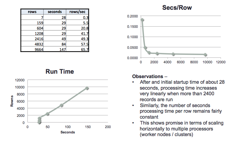
Runs were conducted with a different number of files to measure throughputs and run times with different input volumes
Results
As expected, after an initialization minimum time of about 30 seconds, run times scale linearly with input volumes: throughputs also remain fairly constant even as higher input volumes are used. This showed promise for scaling across multiple worker nodes.
HDINSIGHT MULTI NODE RUNS
Experimental Design
To measure scalability utilizing multiple worker nodes, a trial version of Microsoft’s Azure HDInsight was used.
The experiments aimed to measure the effect of the following variables on throughput in terms of time series processed per second.
- Number of worker nodes
- Number of cores per worker node
- Volume of input data
The graphic below represents the experiments we wished to run (highlighted in green), with the arrows representing the variation of a specific variable.
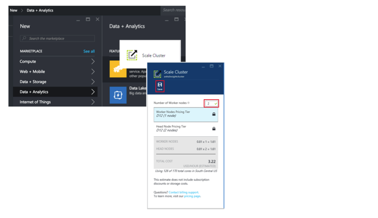
HDInsight Graphical Interface
The screen shot below shows a portion of the graphical interface in Azure which was used to setup the Hadoop clusters, and vary the variables above.
Results
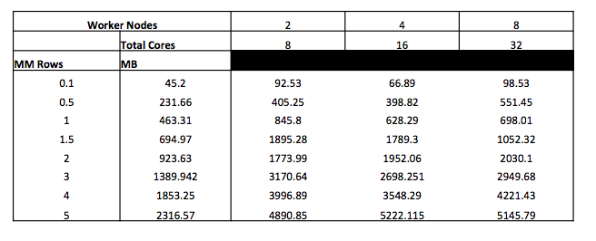
Results are shown below in terms of seconds per run, with varying input data volumes, and worker nodes. A 4 core per worker node configuration was used for these runs.
While the throughouts achieved were much higher than in the single machine setup (around 1000 rows per second, vs. 65 in the single machine setup), we were not able to scale with the addition of worker nodes.
Due to time and subscription limitations we were not able to trouble shoot the issue.
CONCLUSIONS
- Python and related packages allow for relatively simple and compact code to check for a variety of time series characteristics
- Cloudera runs show promise in terms of linear scalability
- HDInsight’s graphical interface allows for quick and easy cluster setup, though credits are used quickly once the cluster is setup
- Further work required to trouble shoot scaling in HDInsight
