I imported data representing Metals trade (I believe, raw, processed or finished metal products) among a specific set of Countries from this source
The nodes represent countries and the directed edges represent imports from one country to another. The edges also have an Amount representing the value of the import / export
The data was in xml so converted it to csv before importing to Gephi
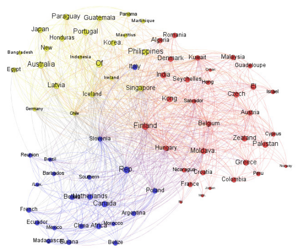
First I used Force Atlas 2 to layout the graph. Then used Modularity to define a Cluster Class for each node and color coded them accordingly
Then I used different measures of centrality, represented by Node size:
1. Weighted Degree
Represents the number of connections (in bound and out bound) for each node, weighed by trade amount. Hence in this view the countries with the most trading partners, taking into account the size of those trade relationships, are the largest ….
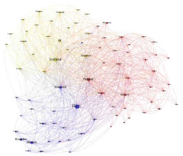
2. Eigenvector Centrality
This measures the importance of country’s trading relationships with other “important” metal trading countries. So for example Japan shows up with a higher ranking here than in the previous graph, presumably because it has trade with other important metal trading countries. Slovenia shows as smaller, perhaps because it has many trading partners that do not rank high in Metal trading
3. Betweenness Centrality –
This measures the degree to which a node is in the shortest path between all other pairs of nodes in the graph. For trading it can be viewed as how important is that country in the flow of trade among other countries assuming a metal or its derivatives may make multiple hops between countries.
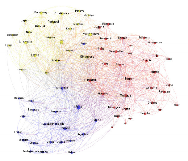
4. Closeness Centrality
Measures how close a node is to every other node. For trading it can be viewed as how few trading hops are needed to trade with another country with whom it does not trade directly – again assuming a metal or its derivatives may make multiple hops between countries. Here for example Latvia shows quite small, my interpretation meaning it is far from many other countries in terms of trading hops.


